10 Invitation Design Requests That Make Every Stationer Cringe
Okay. Real talk, fellow stationers.
We love our couples. We do. They trust us with one of the most personal pieces of their entire wedding, they hand over their Pinterest boards, and they let us do the thing we love for a living. Genuinely a privilege.
But also? Sometimes the requests come in and we have to take a deep breath. Remind ourselves it's their wedding, not ours. Remember that this job is genuinely cool, like, ninety percent of the time.
The other ten percent is this list.
The design requests we've all gotten, the ones we politely talk couples out of, push back on, or quietly grit our teeth and execute anyway. None of this is the couple's fault — they don't live in this world like we do — but if you're a stationer reading this, you're going to nod through every single one.
1. QR Codes
We know they're convenient. We know every other suite has one now. But a QR code on a beautifully printed invitation is like a sticky note on a painting.
The couple is excited about the tech, and we're already mocking up an alternative — a clean URL, a details card, anything but a little black square breaking up the design we just spent hours perfecting.
2. All Caps Everything
They saw it on Pinterest. They think it looks modern. They want the entire suite to SHOUT FROM TOP TO BOTTOM. And listen, all caps has its place — a single word, a clean line of text, a tasteful accent. But the whole invitation?
The guests are coming to the wedding. They don't need to be yelled at in serif.
3. Too Much Information
The details card reading like a short novel. The RSVP card asking for dietary restrictions, song requests, transportation preferences, hotel block info, and an emergency contact. Please please please — go online! That's literally what wedding websites are for.
4. Sexist Guest Addressing
The list comes in: "Mr. & Mrs. John Smith."
All the way down.
We get it — sometimes it's grandma's preference, sometimes it's just what the couple grew up seeing. But it's 2026. The woman has a name. We can write it. It takes ten extra seconds.
5. Maps
Hand-drawn maps of the ceremony, the reception, the hotel block, the rehearsal dinner — every location plotted on a tiny illustrated landscape with little trees and a compass rose. They're cute. They're charming. They're also six hours of meticulous work, and let's be honest — nobody is using them to get there.
Your guests have Google Maps. They're going to use Google Maps.
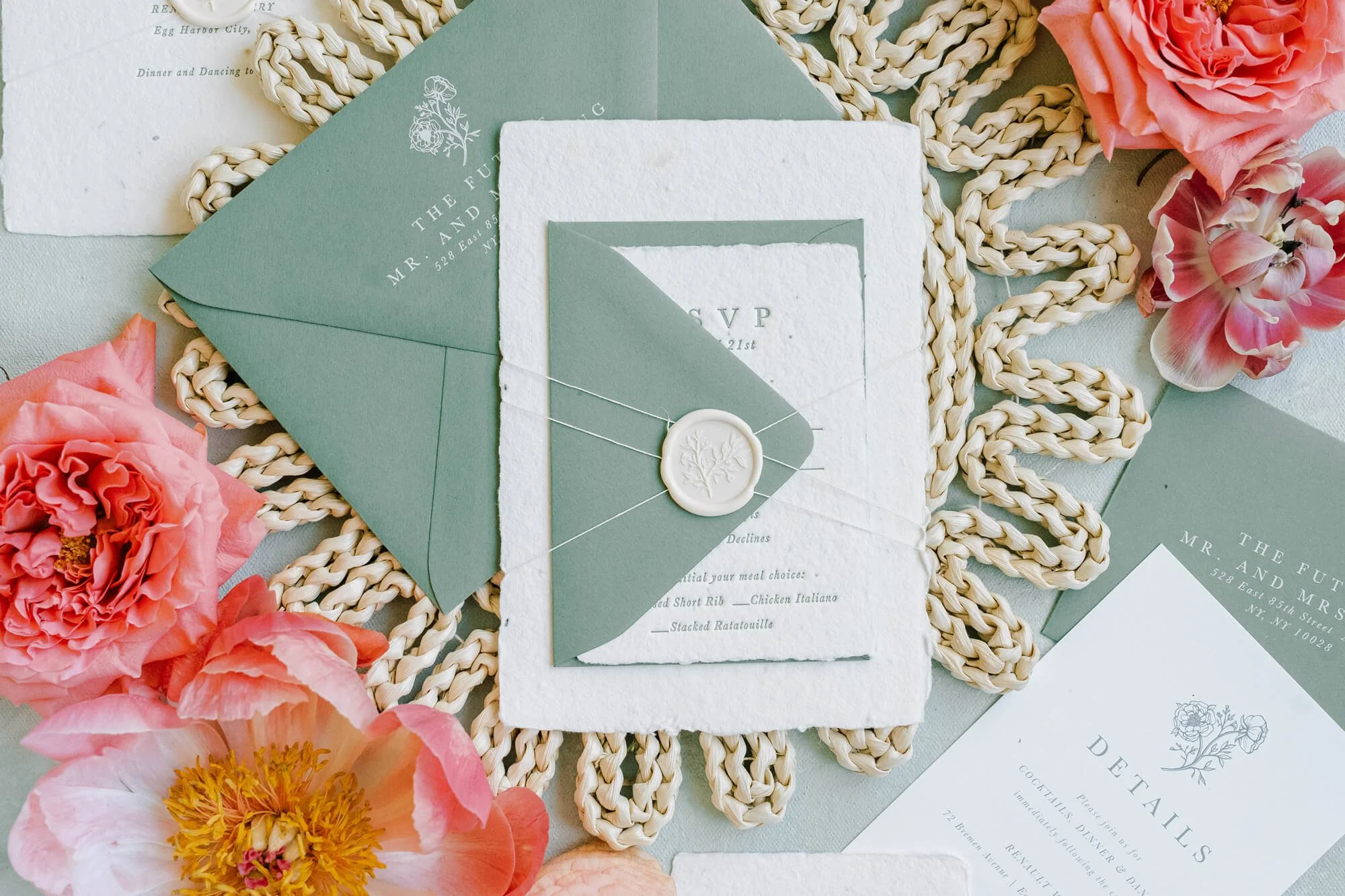
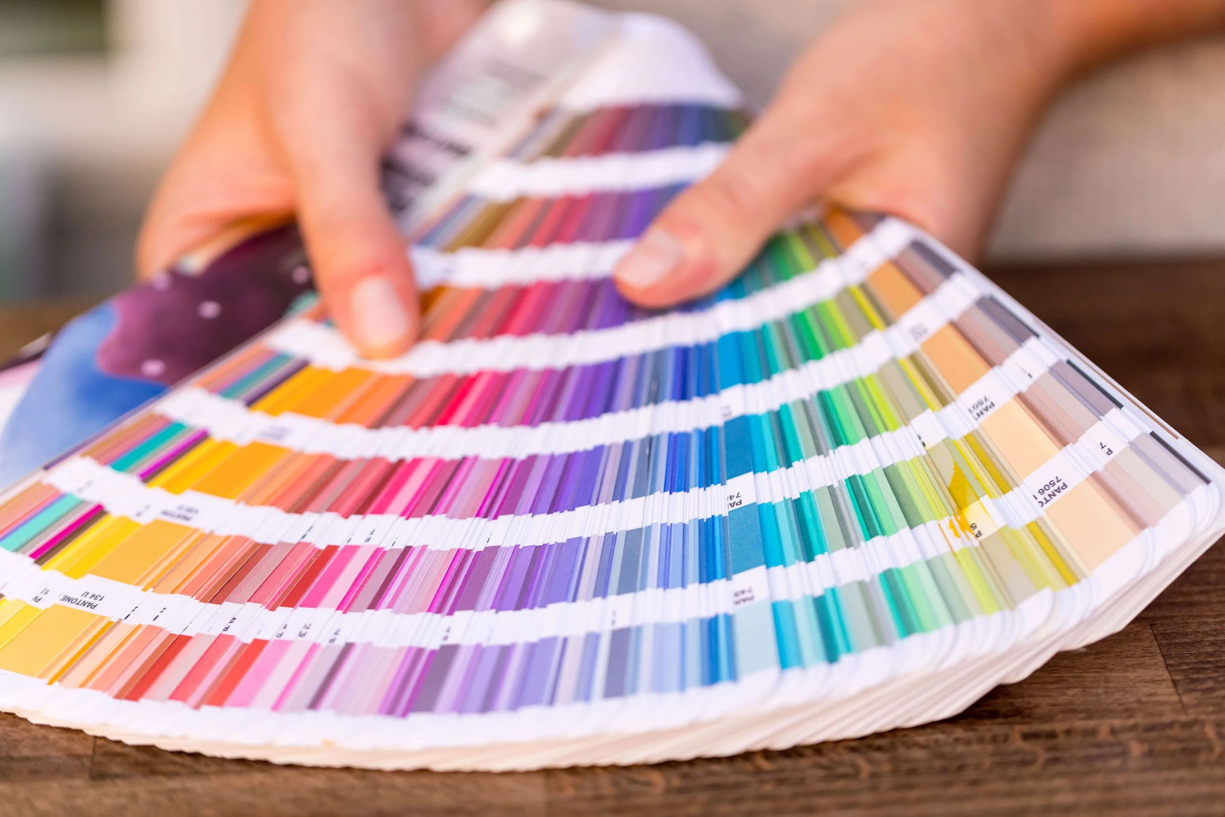
6. The 10-Color Palette
The couple sends a board with terracotta, sage, blush, dusty blue, mauve, ivory, gold, navy, mustard, and aubergine — and wants all of it on a two-piece suite.
I'm good. But I'm not that good. Nobody is.
Here's to quietly walking our couples back to a tighter palette every time, because a focused two- or three-color story is always going to read more elegant than the whole mood board. Save the rest for the day-of styling.
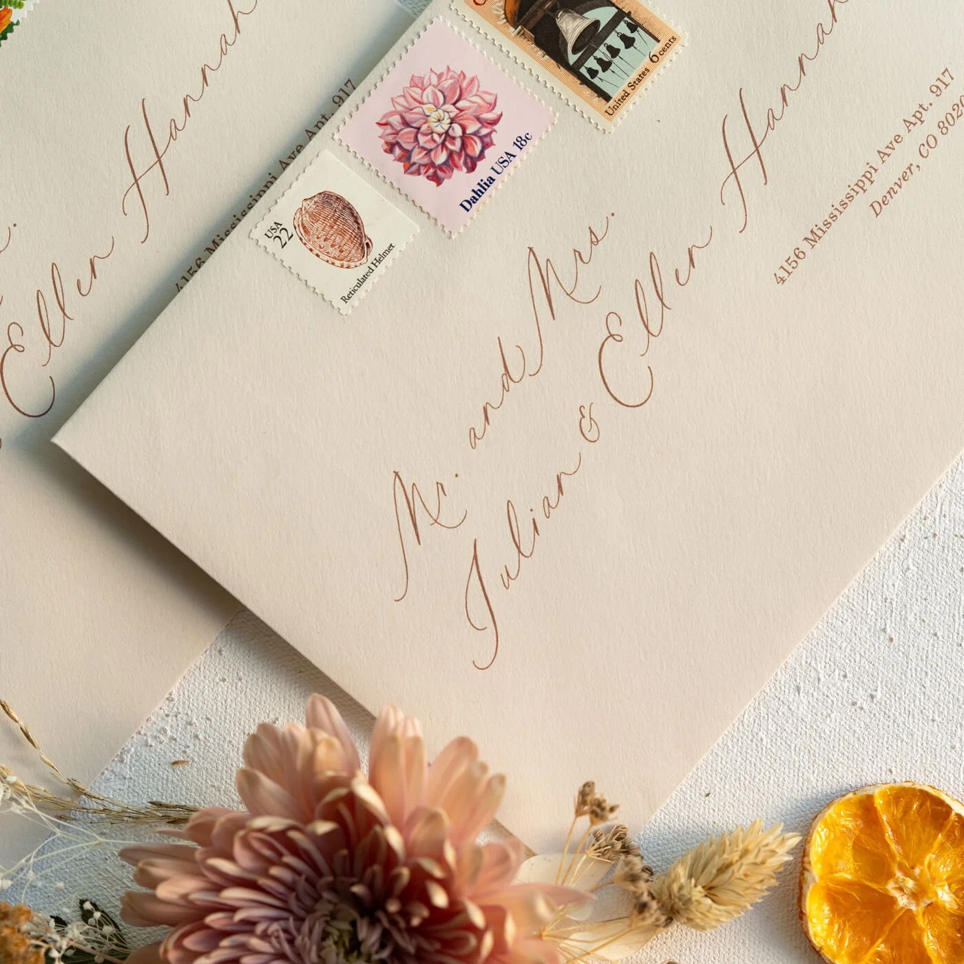
7. The Full Venue Address (Zip Code Included)
I CAN’T. Why does the main invitation need the full street address, suite number, and zip code of the venue? Where do we think the guests are going if not to the address on the invitation? Nobody's mailing a postcard to the church.
The city and state will do beautifully — and it'll look ten times better while it's at it.
Lovely example provided by Minted :)
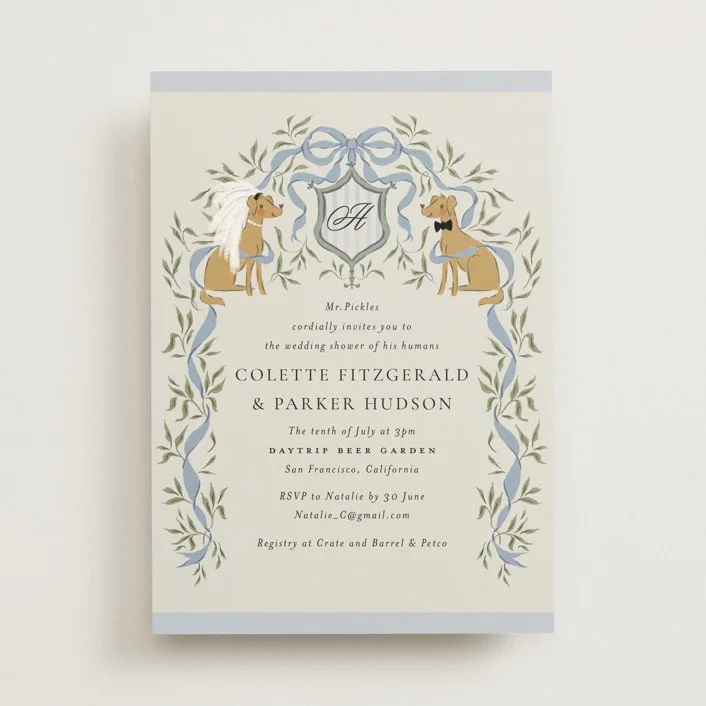
8. Pet Crests and Animal Icons
We need to talk about the pets.
The dog in the family crest. The cat tucked into the monogram. The invitation literally hosted by the dog on behalf of his humans (yes, this is real — see exhibit A).
We love your animals. We do. But the suite doesn't need to be a Noah's Ark situation.
And while we're here — the little chicken next to the chicken option, the fish next to the fish, the cow, the pig, sometimes a tiny vegan carrot if we're really cooking. We're designing an RSVP card, not a children's coloring book.
9. “Can you bump up the font size?”
The request comes in: can you make the font bigger?
Grandma needs to read it. We get it, we love grandma.
But 12 point on a wedding invitation is huge — we're talking textbook territory. Good typography at 8 or 9 point with proper leading will read more clearly than something crammed up to 12 just because the number sounds friendlier.
Trust the hierarchy. Trust the kerning. Designers will cry.
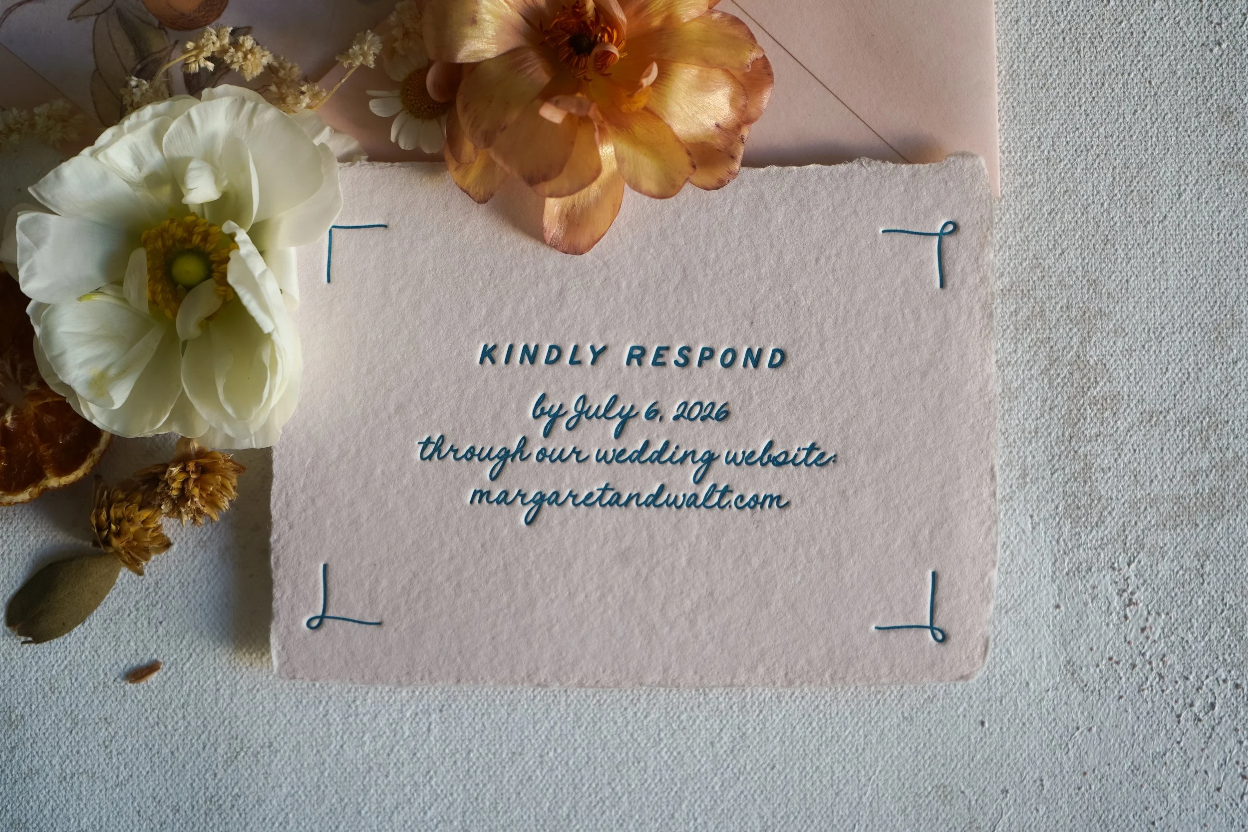
10. https://www. on the Wedding Website
This is the one. The one only stationers are going to fully feel. The couple's wedding website printed out as "https://www.smithwedding.com" — full protocol, www and all. That's not a URL on a wedding invitation. That's a hyperlink dragged out of a browser tab.
I’m going to gently remove it. Quietly. Without telling you. You're welcome.
We love this work. We love our couples.
We love that they trust us with the first thing their guests will hold in their hands.
But every stationer reading this just nodded through ten things in a row (or hopefully, had a few chuckles) — and there are a hundred more I didn't get to.
Also — if you're building a stationery business and want a shortcut to the things I wish I'd known earlier, grab my free Stationery Biz Cheat Sheet — it's packed with the industry essentials that don't always get talked about.